Tee’s by kids
The Client Tee’s by kids
Key words
UX design
Responsive web
Fun
Young
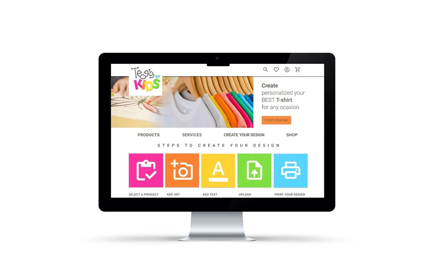
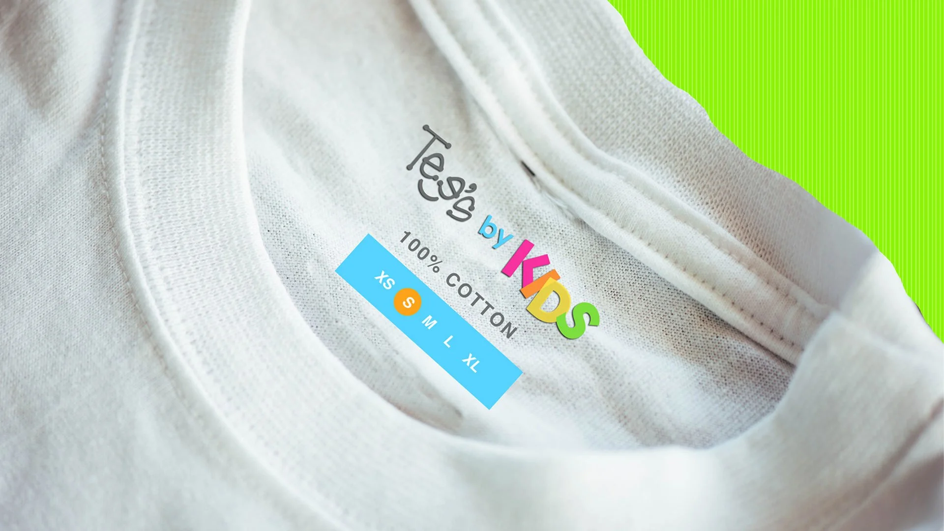
Tee's by kids is an order website to sell t-shirts personalize online. It has a limited collection with different sizes and colors.
It focuses on merchandise designed by the customer. The tone of the site is young and fun with the main visual focus of the brand is the color.
Responsive Web Custom printed T-shirt
PROBLEM
There are several options of online shopping websites that have a kid’s section but that is not enough, instead they have cluttered designs, inefficient systems for browsing through products, and confusing checkout processes.
GOAL
The main goal is to make shopping fun, fast, and easy for all types of users, and create a responsive website that offers the best printed memories for kids. The vision is to spread the joy of having a good memory for our kids and to build a personal design and connection with our kids.
TARGET AUDIENCE
Our target audience are users between 18 and 45 years old that whether you’re in need of hundreds of T-shirts or just one t-shirt.
DESIGN PROCESS
Research
I explored different ways this problem has been solved previously and took notes about the options, I conducted user interviews, which I then turned into empathy maps to better understand the target user and their needs. I discovered that many target users treat online shopping as a resource that offers a better and efficient service. However, many shopping websites are overwhelming and confusing to navigate, which frustrated many target users. This caused a normally enjoyable experience to become challenging for them.
Key Scenarios
+ People want to get a custom print t-shirt, select the color, material, quantity, quality, order and pay online in easy and friendly steps.
+ Art lovers want to find a specific type of printed product and browsing to see if it is available to purchase.
+ People want to learn and select new materials for their t-shirt and new printed techniques.
Questions to Address
+ How will people search and discover new printed services?
+ How many varieties of products to include without overwhelming customers with too many choices?
+ How might the platform make choosing or buying products (t-shirt) more customizable?
+ What resources customers will need when order online?
STARTING THE DESIGN
Sitemap
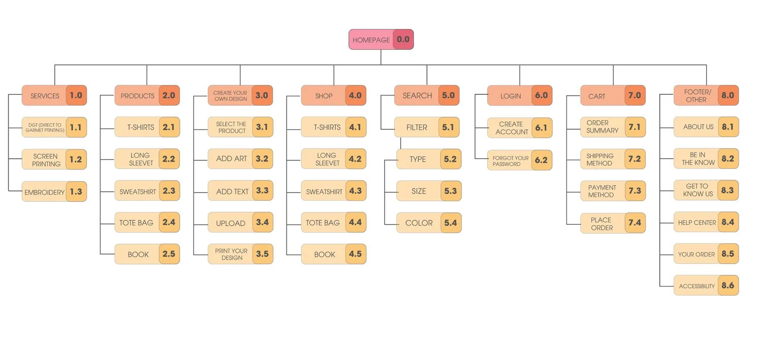
Based in the pain points, I used that knowledge to create a sitemap. The order is the most important in the structure, so I chose the design to make things simple and easy. Difficulty with website navigation was a primary pain point, my goal here was to make strategic information architecture decisions that would improve overall website navigation.
Digital Wireframes
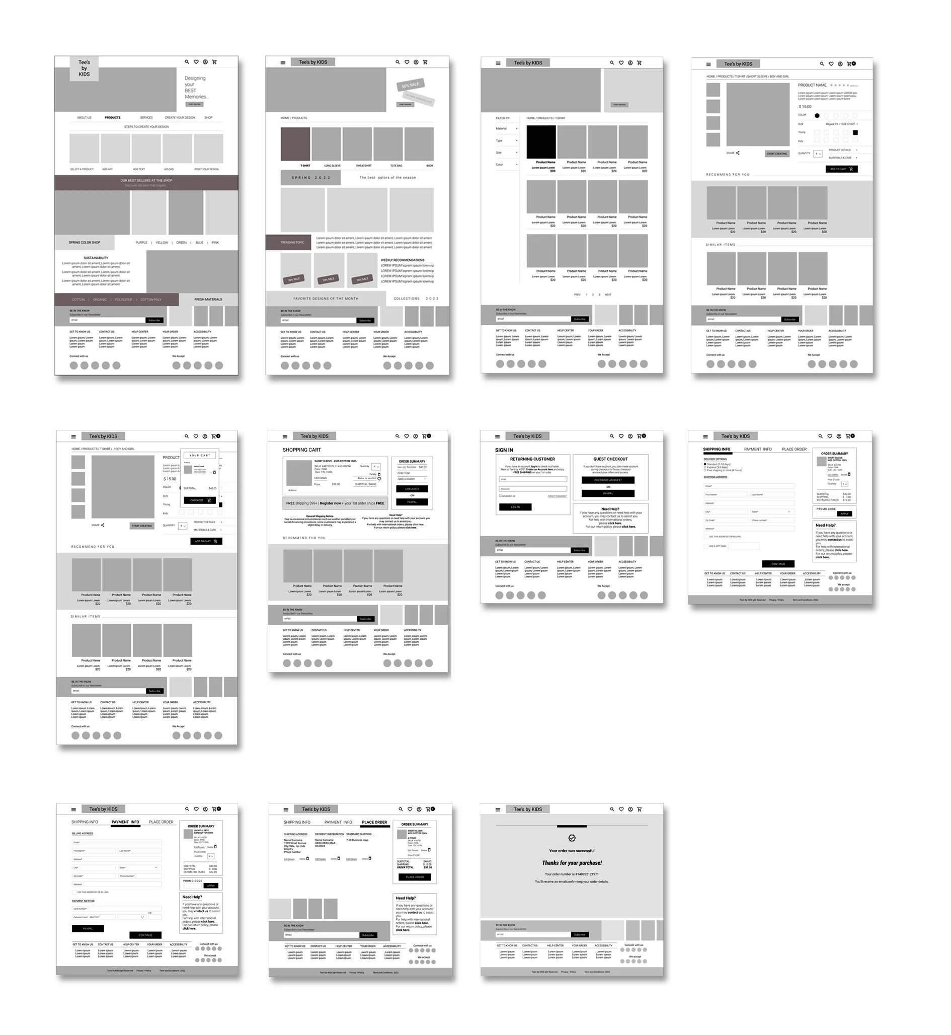
Next step was moving from paper to digital wireframes, it was easy to organize and made it easy to understand how the redesign could help address user pain points and improve the user experience.
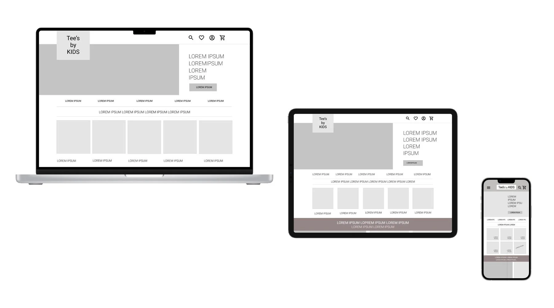
Tablet and Mobile version
Digital wireframes screen size variations.
Low-Fidelity Prototype
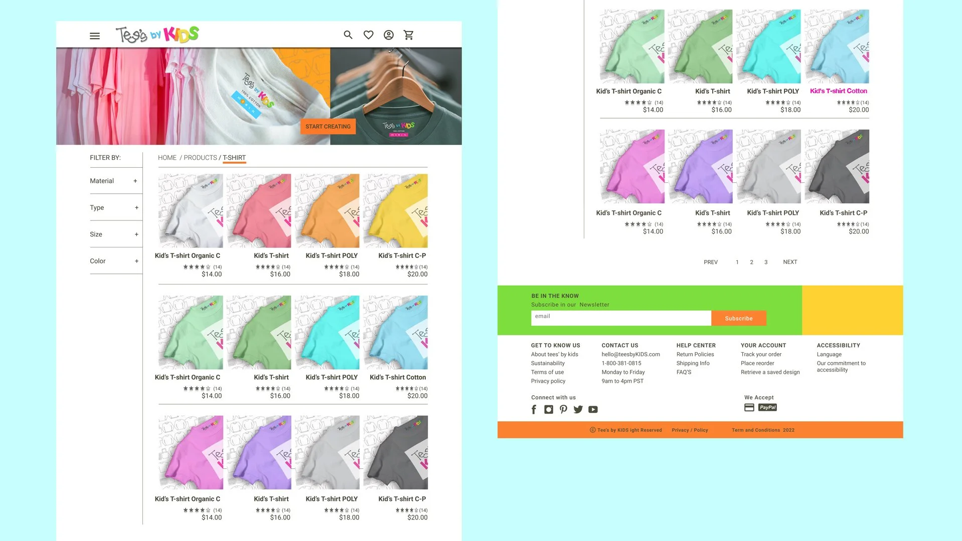
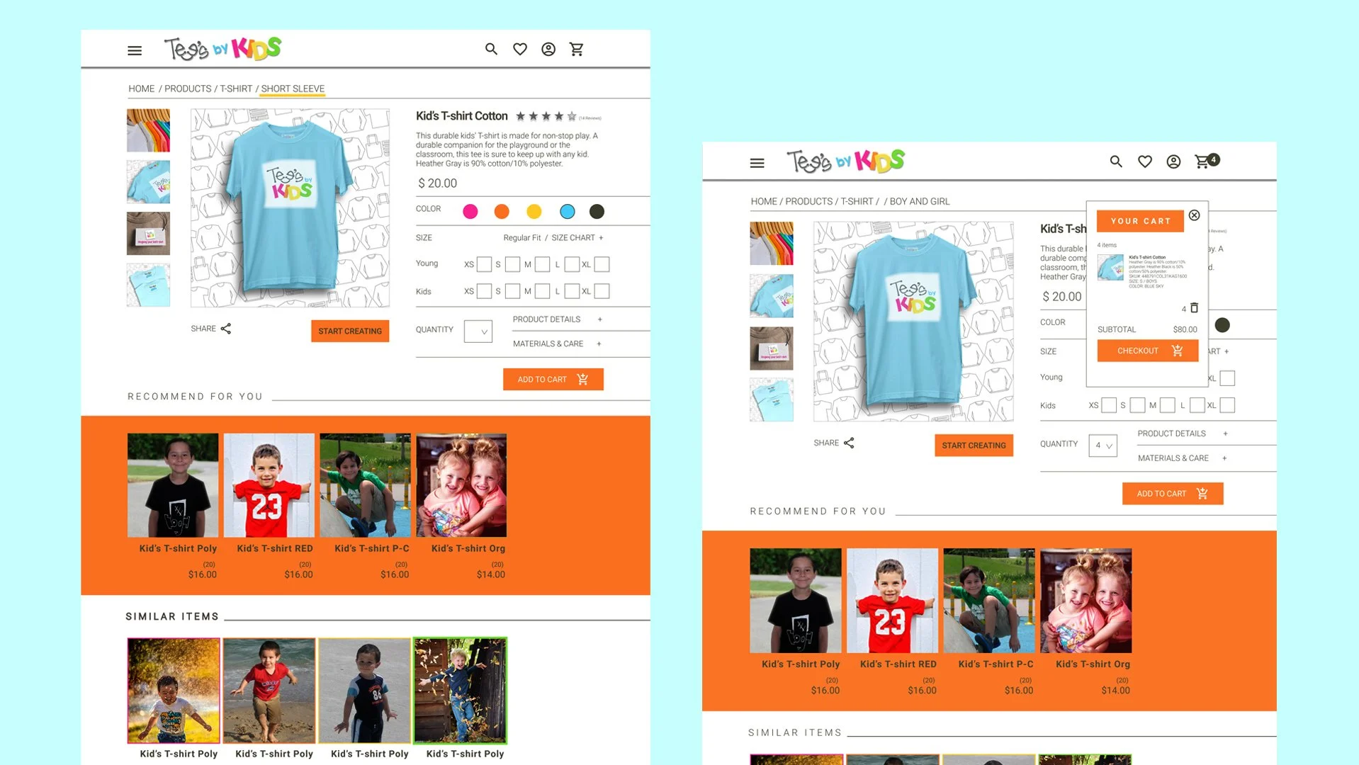
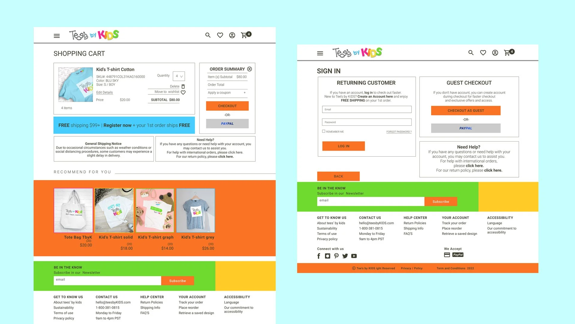
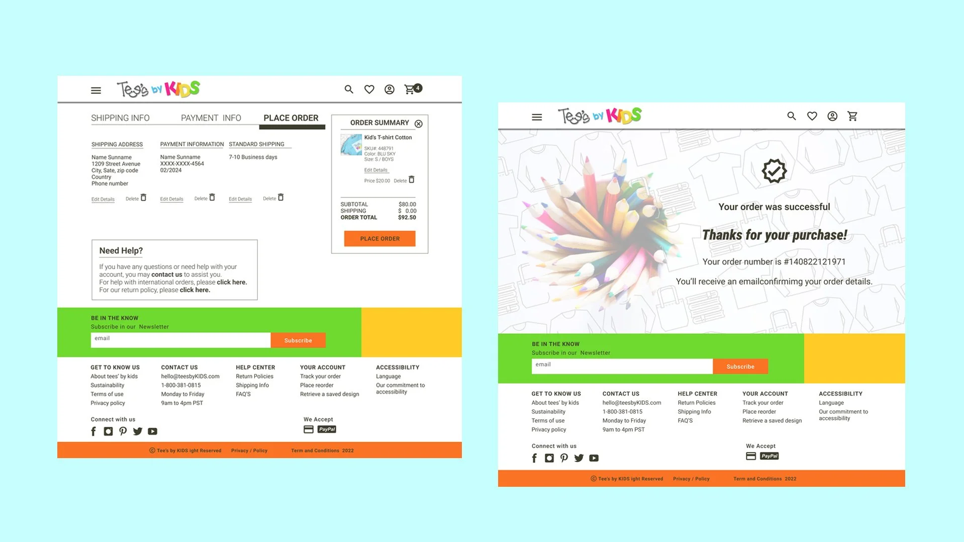
Using the completed set of digital wireframes, I created a low-fidelity prototype. The primary user flow I connected was building a product catalogue, product page, product-cart, shopping cart, and place order.
Final DesignHigh-Fidelity Prototype
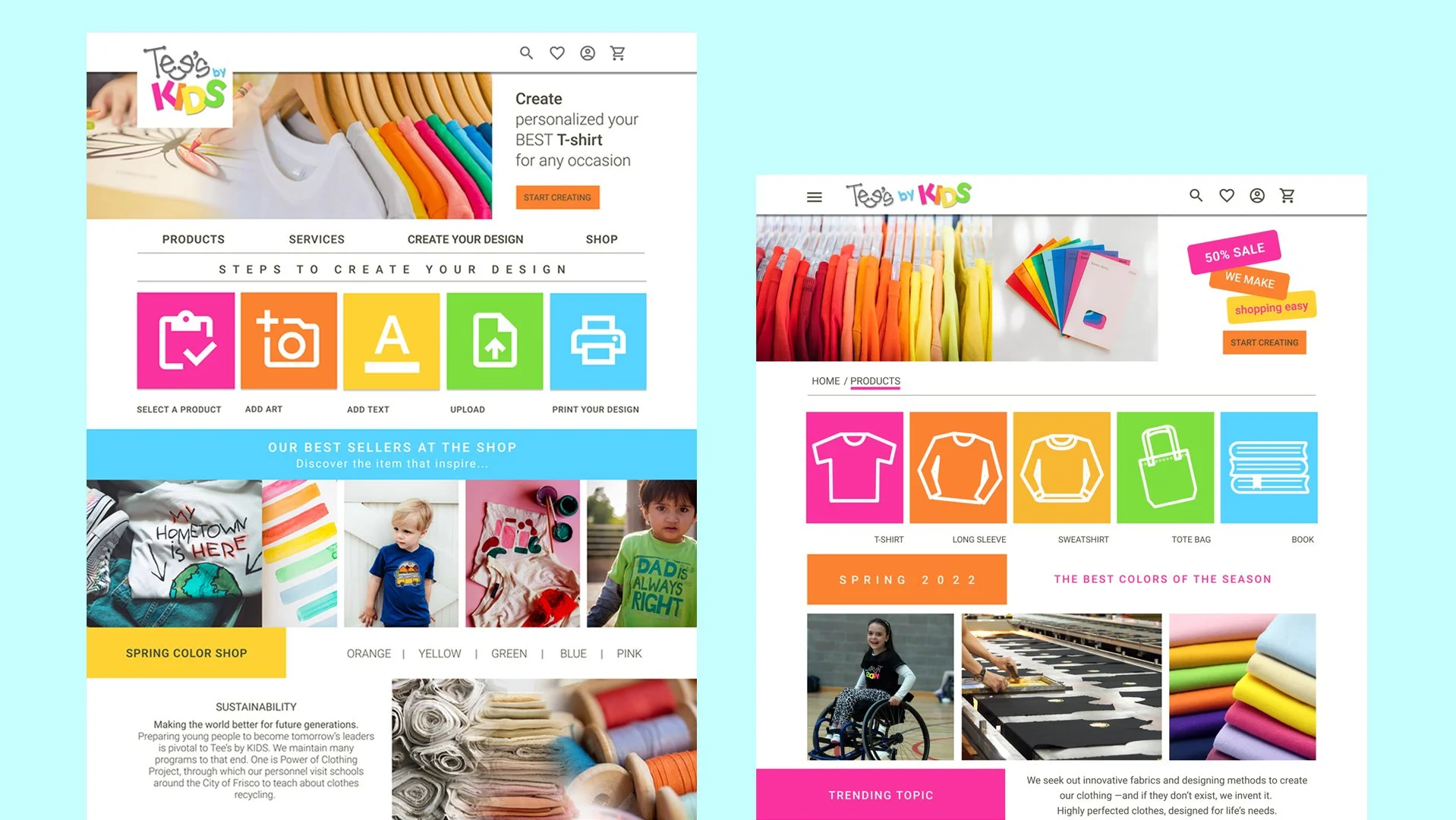
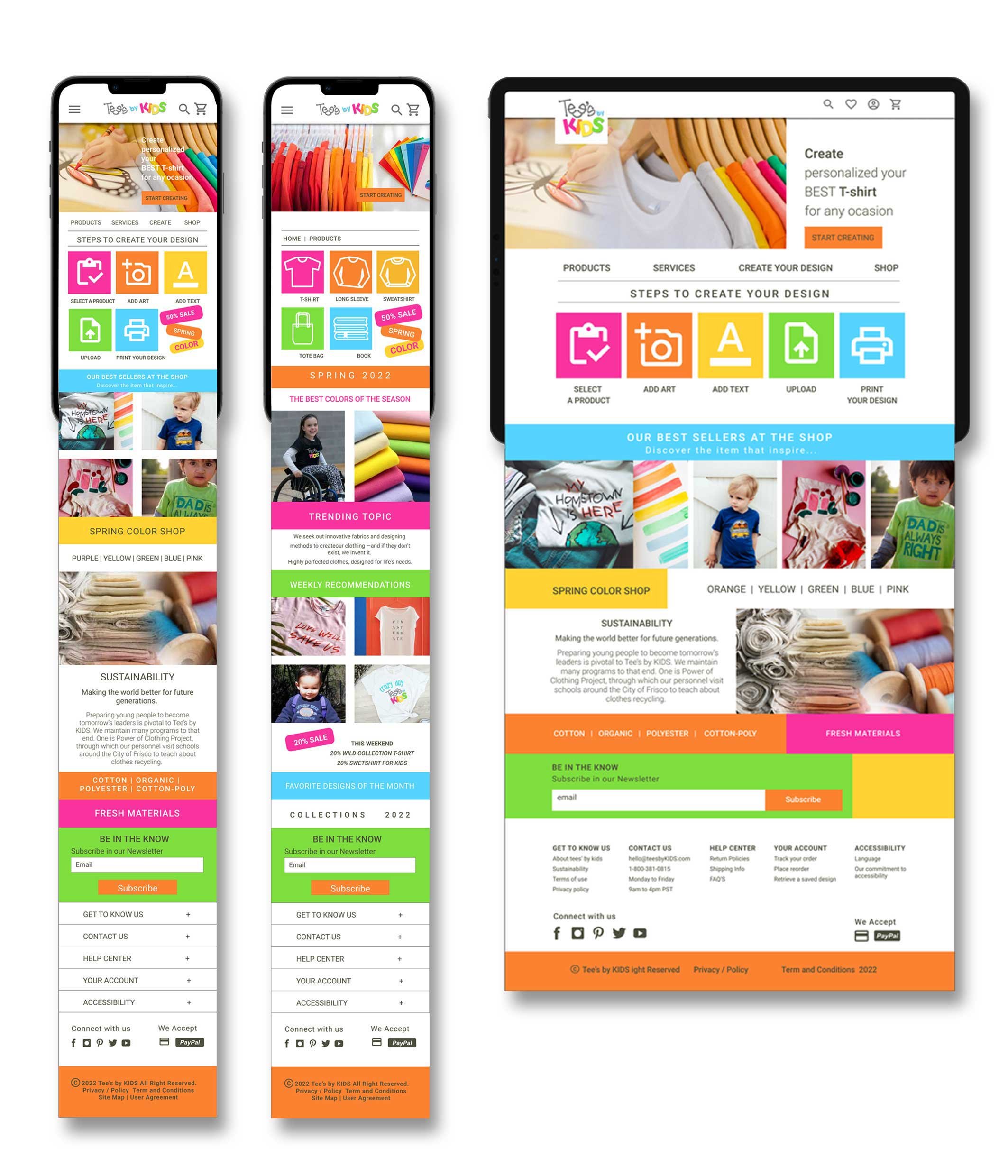
Final deliverables for the Tee's by kids responsive website include Figma prototypes for the main page, product page, catalogue page, shopping cart, logging in, and checkout.
01. MAIN PAGE
02. PRODUCT PAGE
03. CATALOGUE PAGE
04. PRODUCT CART
05. SHOPPING CART
06. CHECKOUT PAGE
High-fidelity prototype presents a cleaner user flow for ordering, access to product, create your own custom t-shirt and checkout.


